Davide Piscitelli
UX/UI Designer
Visual Designer
TYPE Designer
Biography
I’m a UX/UI Designer with a strong foundation in visual design and a deep passion for typography. I specialize in crafting intuitive, minimalist interfaces that prioritize clarity, coherence, and seamless user experiences. I believe that effective digital interactions stem from thoughtful visual hierarchy, meticulously designed typography, and a user-centered approach.
My professional journey started in an unexpected field—aeronautical engineering. At the Technical Institute A. Malignani in Udine, I developed analytical thinking, problem-solving skills, and a structured design methodology. These abilities now shape my approach to UX, where I balance logic with aesthetics to create functional and engaging digital products. Motivated by curiosity, I transitioned into design through self-initiated exploration, later refining my expertise with specialized training in UX and Graphic Design from Google Academy and CalArts.
Influenced by design pioneers such as AG Fronzoni, Bob Noorda, Bruno Munari, Jan Tschichold, Jost Hochuli, and Massimo Vignelli, I have cultivated a keen eye for timeless typography, geometric precision, and an elegant monochrome aesthetic. To me, typography is more than just a visual tool—it’s a fundamental element of communication, shaping the way users navigate and interpret information.
For me, black and white are more than colors; they represent the equilibrium between structure and creativity. By embracing this refined simplicity, I create interfaces that are both functional and visually compelling—where usability meets aesthetic harmony.
projects
UX/UI design


Easylist app
Easylist is a task management app that helps you get things done. It's easy to use and keeps your tasks organized so you can focus on what's important. With Easylist, you can create lists of tasks, add due dates, and set reminders. It's the perfect way to stay on top of your to-dos.
project Link
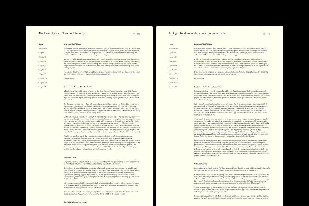


THE BASIC LAWS OF HUMAN STUPIDITY
Carlo M. Cipolla's academic work, originally published in English in 1976 and Italian in 1988, is featured on a website with a simple, responsive design that works on any device. The use of different weights of the classic Times New Roman font enhances readability and simplicity, while emphasizing visual structure for an easy reading experience.
project Link
Visual Design


ELEUTERIA EDIZIONI
Eleuteria Edizioni, a publishing house in Venice, publishes Greek and Latin classics from the Renaissance. Their logo combines the sun and a chariot wheel, which symbolizes freedom. The Bembo typeface is used as a tribute to Aldo Manuzio's typography work. The company's website design is modular and versatile, and it uses the Bembo and Gill Sans typefaces to ensure legibility and aesthetic appeal.
project Link


BRUNO LONGO
Bruno Longo is a high-end men's clothing store in Trieste that focuses on top-notch tailoring and traditional Italian craftsmanship. Their brand combines classic style with modern touches. Their logo blends old-school craftsmanship with a modern industrial look, using Bodoni for elegance and Semplicità for a contemporary feel. The black and white color scheme gives a sleek and polished look. The overall impression shows a strong attention to detail.
project Link


KARMEL
Karmel, an Italian company that makes wooden chairs, cares about the environment and uses traditional Italian craftsmanship. Their brand is all about simple design and quality workmanship, reflecting the timelessness of Italian style. Their logo uses a clear and easy-to-read font called Forma DJR. The company's visual style focuses on typography and uses a black and white color scheme to emphasize its minimalist approach.
project Link
Type Design
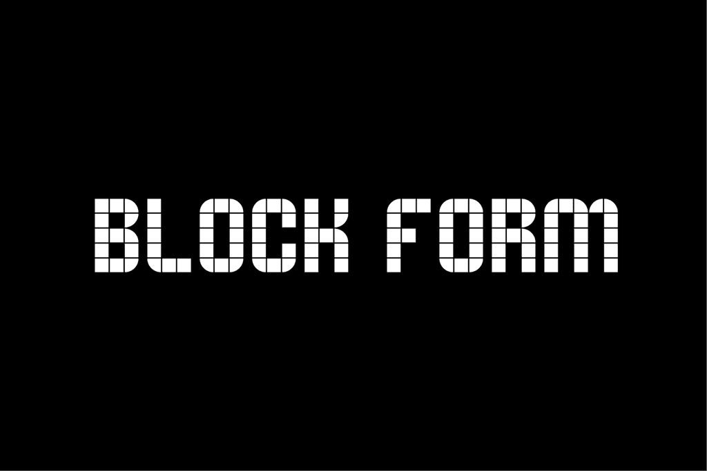

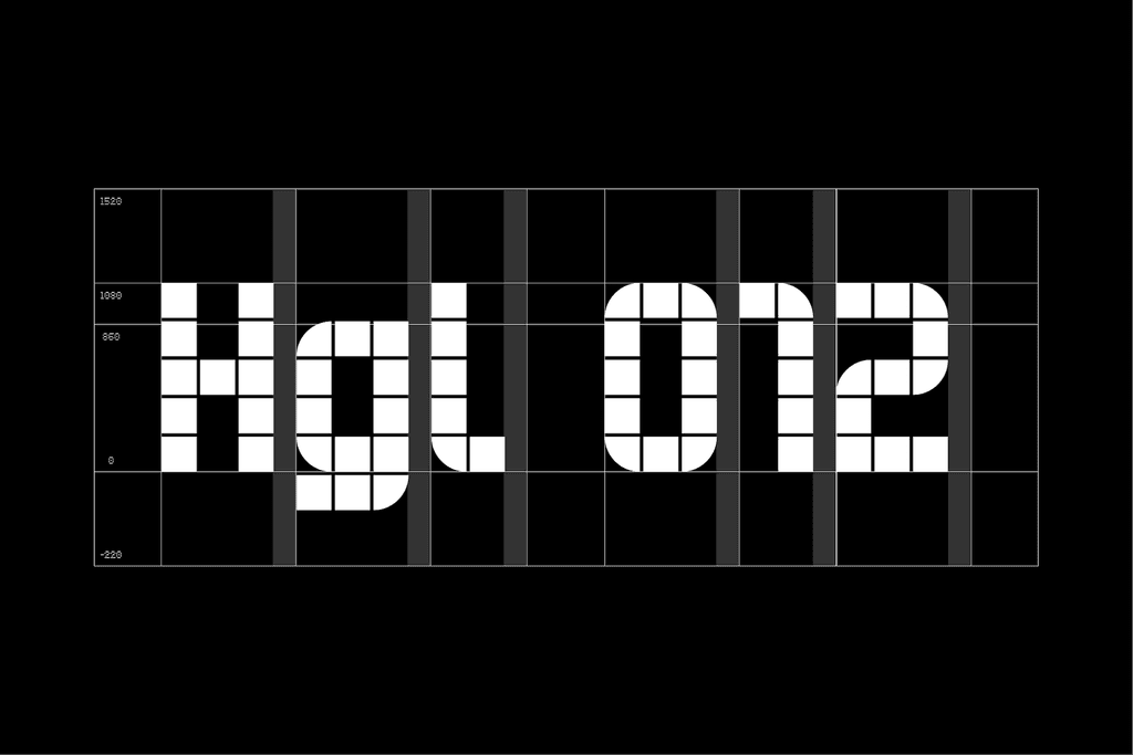
Block Form
Block Form is a font that is both elegant and versatile. It was originally designed to make signs for a home goods company look better, but it has since become popular for use in business cards, headlines, and other designs. Its geometric, modular structure makes it suitable for any artistic need.
project Link


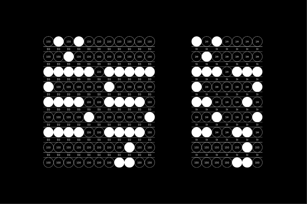

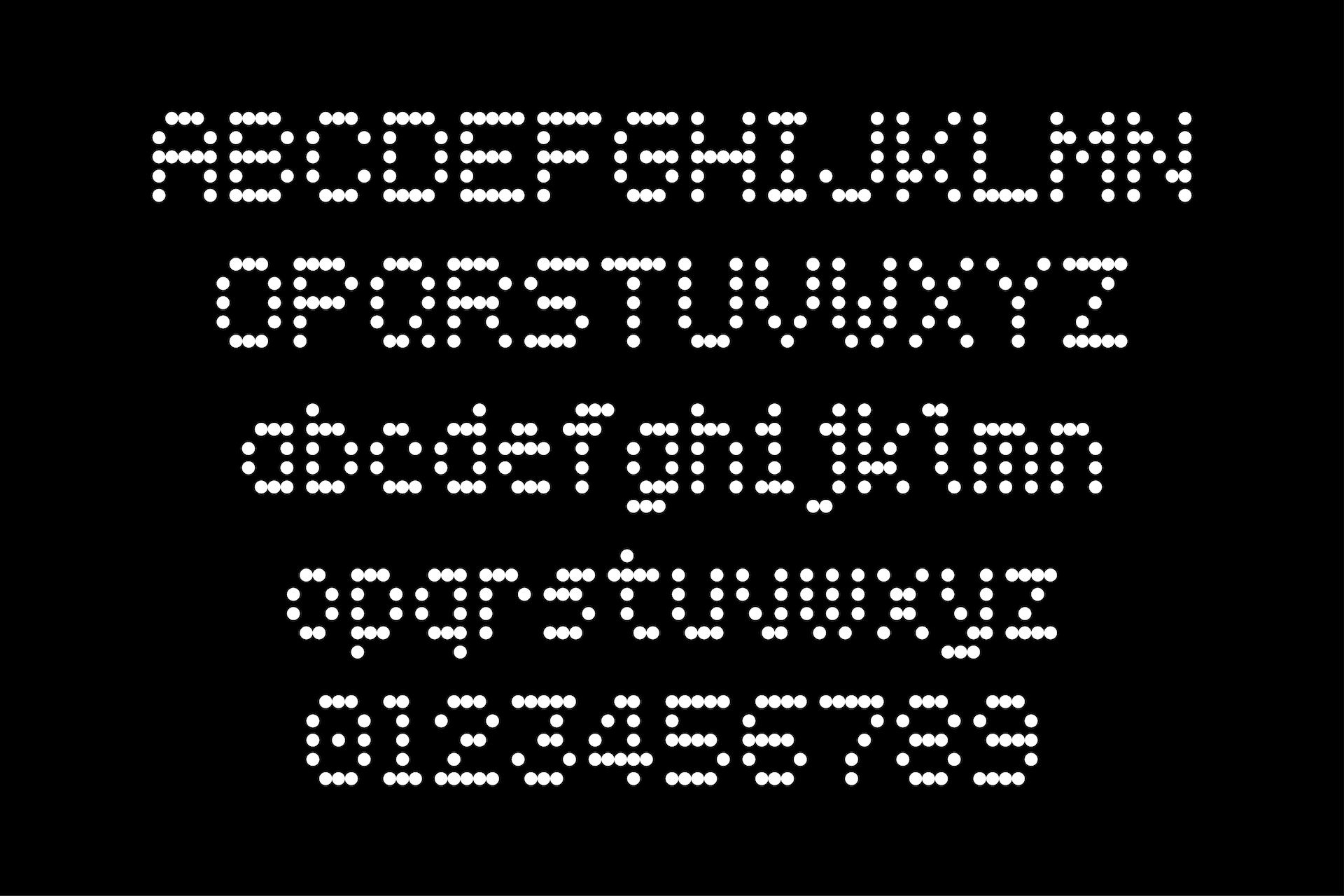
Tecnica Typeface
Tecnica 55 and Tecnica 53 are typefaces inspired by dot matrix output. Tecnica 55 employs a 5x5 dot matrix resulting in bold, geometric letterforms, whereas Tecnica 53 applies a 5x3 matrix rendering a compact, minimalist appearance. Both are perfectly suited for technical and electronic material, demonstrating a high-tech and accurate aesthetic.